If you are a consumer or a marketer or a CEO of a company, you should be interested in what makes a great logo. In an age of seemingly infinite products striving for consumers’ money and attention, branding is more important than ever to ensure a successful marketing effort. Great logos are the embodiment of an entire company and tell a story about the quality and character of the product or company it represents. A great logo can inspire and bring immense success to a company.
Conversely, a poor logo can be disastrous for a company. Companies that took their branding lightly during their inception may suffer in the long run and may even go out of business because of the fact. Even if a product or service is best in class, an unprofessional, confusing, or offensive logo can turn off customers or destroy all credibility.
For a brief overview, you can concentrate on the four principles that make for a great logo. It must:
• follow solid basic design principles
• be functional
• represent the company
• be unique
If your logo doesn’t have all four qualities, you may be losing customers or worse.
1. A Great Logo Must Follow Basic Design Principles

This may be the most obvious necessity for great logos: it must be designed well and look good. The aesthetic appeal of a logo, or any piece of art or design for that matter, is subjective and relative to a person’s mood when they view the it, however, there are fundamentals of design that must be followed to ensure that a logo will appeal to anyone.
The fundamentals include, but are not limited to space, color, form, consistency, and clarity. It is recommended that a design professional have some influence on your logo, whether it be redesign or touching up, to ensure basic design principles are followed.
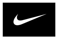
What may result otherwise is a logo that looks like a third grader designed it. The story of the child who designed the Nike logo is amusing, but it is false. In fact, a design intern at Nike named Caroline Davidson came up with the idea in 1971 for $35. But much more effort was put into the design after the initial concept. The result of a massive marketing effort was a universally known logo that abides the basic fundamentals of design.
2. A Great Logo Must Be Functional
Great logos need to represent a company in many different contexts and still get the message across. A logo may be seen on the web, or on a variety of promotional products such as a brochure, a t-shirt, or on glassware. It could be used on dark backgrounds, on light backgrounds, on textured surfaces, or could be used in various sizes like on an awning or on a postcard. A major indication of a poorly designed logo is graphic effects that can be added in Photoshop like 3D embossing, shadows, glares, or photo imagery. It’s important to know that simplicity does not mean that the logo is missing anything. In fact, to aid in functionality, the logo must be simple.
A great logo must have the ability to be printed or used in all of the contexts mentioned above and still represent the company effectively. A few things that are important when talking about functionality are the simplicity, scalability, color, and depth. It’s important to the functionality of a logo that it’s not too intricate and that it doesn’t incorporate things like gradients or shadows as integral parts of the design. When the logo is reduced in size or placed on a loud background, it should retain its integrity. In addition, the logo should allow for two color presentation, such as black on white, as it would be on a t-shirt.
3. A Great Logo Must Represent the Company
A logo needs to represent the company it serves. This means that the style must be easily identified with the industry/product/service and must give a clear picture of what is being marketed. If a company is selling auto parts, a delicate script font would not capture the essence of the company; a suitable font would be bold and sturdy-looking.
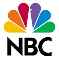
A logo sets the tone for the company and this applies to single-serving logos like Dasani or a multipurpose logo like NBC. In the case of Dasani, we are given a clean, smooth, cold-looking logo to represent water and with NBC we are given with a multicolored peacock representing the different divisions of NBC. Originally the logo was created to show enhancements in color broadcasting, also a good representation.
A great logo must encompass the entire company too, not just one aspect of it. In the 60s, AT&T had a bell logo which represented the clarity of sound and references Bell Telephone Laboratories. In 1984, AT&T introduced a logo representing a wider range of services and a more modern look to reflect the major advances that the company helped invent like the transistor, the solar power cell, and unix operating system. The modern At&T logo conveys the world covered by the company. Each designs captured the essence of the company at the time of usage.
4. A Great Logo Must Be Unique
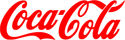
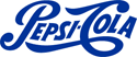
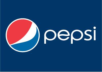
Another important trait of good logos is the the ability to stand out against the crowd. Copycat logos are destined to fail or be confusing to the consumer. Usually they will result in a loss in sales. When Pepsi Cola had a similar logo to the already established Coca-Cola, it suffered in the competition between the two soft drink companies. Only when Pepsi switched their brand to something unique did they see a major increase in sales.
A unique logo will also tend to be one that stands the test of time. Cookie-cutter logos that bank on trends of the day will look dated and need to be replaced after the trend dies off. In the late 90s, the swoosh logo was popular. It was everywhere and it quickly became dated.
By ensuring your logo adheres to design principles, is functional, representative, and unique, you have a good chance of ensuring it’s great.
![]() View the top ten logos of all time.
View the top ten logos of all time.
![]() Have your logo critiqued here.
Have your logo critiqued here.